June 13, 2007
Gratuitous Art Posting
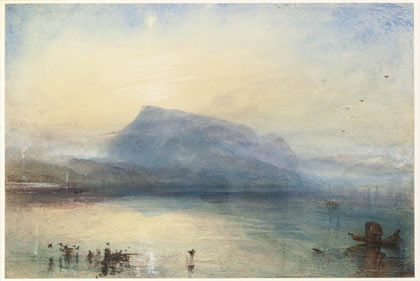
The Blue Rigi by JMW Turner (c. 1841)
This is cool. The Tate Gallery is running an exibit of Turner watercolors and sketches.
Turner's beginnings were the colour studies he made more or less throughout his career in which he worked most freely with paint, working out tonal perspectives, the effects of light and shade, freeing landscape from specifics. They are like aide-memoires of the very essence of his art.
Rough drafts, if you will, but still fascinating.
When I lived in London, I slid down to the Tate whenever I got the opportunity, there to spend hours goggling at their big collection of Turner oils. Never got tired of them.
UPDATE: Of course, I used to see this sort of thing all the time....
My favorite part of that bit has always been when Chapman goes offscreen to reprimand little Ralph and after a moment, Cleese just turns and gives Kevin a slap for apparently no reason.
Posted by: Gary at June 13, 2007 11:42 AMI love Turner.
Posted by: Mrs. Peperium at June 13, 2007 11:49 AMHey Robbo, what do you think of Frederick Church or Fairfield Porter? Two very different styles. Chruch is closer to Turner. But both men painted in America on the same latitude lines (as on a globe) as Turner painted in England and you can see it in their sunsets and sunrises. The colors both men use are incredible -just like Turner.
Neither of the two had themselves tied to a mast to paint a snowstorm nor did they mistakenly believe they were ladies' men -like Turner.
Posted by: Mrs. Peperium at June 13, 2007 11:54 AMGary - agreed. And I never get tired of it.
Mrs. P - Actually, some of Church's stuff reminds me even more of Constable, but I know what you mean. Porter, I have to say, strikes me as second-string Hopper.
It's a curious thing that while I am largely (but, of course not solely) pre-Romantic in my musical tastes, I take a great deal of pleasure in many 19th and 20th Century art styles (the various schools of realism, impressionism and even post-impressionism). Can't stick abstracts, tho.
Hopper and Porter? Hmmn... they both seem so different. Their color use can be similiar but Hopper is much more into detail. Porter is light and effusive. You can feel the sun on your back when you look at his stuff...
How about Winslow Homer? He's from Cape Elizabeth...
Posted by: Mrs. Peperium at June 14, 2007 07:35 AM
I was thinking of some of Hopper's lighthouses, where the glare of the sun off the ocean makes me squint involuntarily.
As for Homer - yes, please.
And while we're at it, let us not forget the multigenerational talent of the family Wyeth.
Indeed, we must not.
Posted by: Mrs. Peperium at June 14, 2007 11:50 AM
 Image courtesy of the lovely and talented