June 06, 2007
Indeed
Ladies and Gentlemen, Mr. James Lileks:
From rule to cool to Fool, Brittania: the logo for the Olympics has been revealed.Seriously, what is the matter with people who come up with this? And what is the matter with the people who approved it? Ads that showed the logos have reportedly caused seizures among British epileptics, but I think this thing would make a fossilized femur bone suffer convulsive muscle spasms. If you cant tell, its the year of the London games 2012. I think its also meant to imply a human form say, a discus thrower, or a runner bursting from the blocks. Whatever it is, its an aesthetic catastrophe, and would seem to indicate theres no one around in the London Games who had the nerve to bark rubbish, that; try again, and give me a proper logo with some bloody numbers. I think theres a point at which people lose the ability to pretend they have any sort of aesthetic criteria, and embrace whatevers loud and ugly simply because loud and ugly is the style of the times. Theres always a fair amount of coin to be had for dissing the traditionalists, of course; I imagine that if someone submitted a logo with a flag or a bulldog they would have suffered a gentle sneer: still pining for the empire, eh, Smithson. Well, Kiplings dead. Yes he is. Dig him up, youll find Posh Spices heel stuck in his heart, the coffin stuffed with I Heart Diana memorial teddy bears.
Ugh.
I won't repost the logo in question here since we Llamas don't much care to get sued by somebody who's suffered an epileptic seizure from looking at the thing. Go on over to El Bleat to see it if you dare.
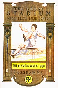
UPDATE: Just by way of comparison, here's the poster for the 1908 London Games, back in the day when Britain believed in herself:
Wait, there isn't a competition for Worst. Logo. Ever.? This was the heavy favorite for the gold.
Posted by: rbj at June 6, 2007 12:24 PM

 Image courtesy of the lovely and talented